

There are five main types of Balance
used in graphic design:
1.
Symmetrical balance:
This is the most formal type of balance, where elements are mirrored across a
central axis. Imagine folding the design in half and having both sides be
identical. This creates a sense of stability and order.
2.
Asymmetrical balance:
This type of balance uses elements with different visual weights that are
arranged in a way that still feels balanced. It's more dynamic and can create a
sense of tension or interest.
3.
Radial balance:
Elements radiate outward from a central point, creating a sense of focus and
unity. This is commonly seen in logos and circular designs.
4.
Mosaic balance:
This involves using a repeated pattern or grid to create a sense of balance,
even if the individual elements themselves are not symmetrical.
5.
Discordant balance:
This is a more unconventional approach where elements are deliberately
unbalanced to create a sense of tension or disruption. It's used to grab
attention and challenge the viewer.

Symmetrical Balance
in graphic design is achieving a mirrored effect. Here are some key rules to
follow:
- Central
Axis:

Imagine a straight line dividing your design in half, vertically, horizontally, or even diagonally. Elements on either side of this axis should mirror each other, creating a sense of reflection.
- Equal Visual Weight:

Each side of the composition should have roughly the same visual weight. This considers factors like size, color, and shape. A large element on one side can be balanced by a group of smaller elements with similar combined weight on the other.
- Mirrored Placement:

Text, shapes, and images should be mirrored across the central axis. This doesn't require them to be identical copies, but their visual impact should be similar.
By following these rules, you can create a stable
and formal composition with a strong sense of order and balance.
Asymmetrical Balance,
unlike its symmetrical counterpart, thrives on creating visual harmony through
unequal elements. Here's what you need to consider for achieving successful
asymmetrical balance in your designs:

- Visual Weight:

This is the key concept. Elements in your design don't have to mirror each other, but they should create a sense of balance despite their differences. Size, color, value (lightness/darkness), and position all contribute to visual weight. A large bold element on one side can be balanced by a cluster of smaller elements with contrasting colors on the other.
- Focal Point:

Asymmetry often centers around a dominant element that grabs the viewer's attention. This focal point can be achieved through size, color contrast, or placement.
- Negative Space:

- Balance
by Rule of Thirds: Imagine dividing your design
into a 3x3 grid. Placing your focal point along one of the intersecting
points can create a natural tension and guide the viewer's eye around the
composition.
- Hierarchy
and Order: Even though asymmetrical, there
should still be a sense of order and hierarchy in your design. Use size
and placement to guide the viewer's eye through the most important
elements first.
Remember, achieving asymmetrical balance can be more
intuitive than following strict rules. Experiment with different layouts and
placements to see how elements visually counterbalance each other. Don't be
afraid to adjust the size, color, or position of elements until you achieve a
composition that feels harmonious despite the asymmetry.
Radial
Balance,
unlike symmetrical balance, focuses on creating harmony by radiating elements outwards
from a central point. While there aren't strict rules, here are some key
principles to follow for a strong radial composition:
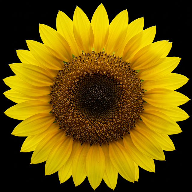
- Central
Focal Point: This is the heart of radial
balance. It can be a single dominant element, a cluster of elements, or even
an empty space that draws the eye inwards.
- Radiating
Elements: Elements like shapes, lines, or
patterns should flow outwards from the central point. This creates a sense
of unity and emanation. The elements themselves can vary in size and
detail, but their overall arrangement should feel like spokes on a wheel
or petals on a flower.
- Repetition
and Rhythm: Repeating shapes, colors, or
patterns along the radiating lines reinforces the sense of balance and
movement. This repetition can be exact or subtly varied to add visual
interest.
- Color
and Value: Consider how color and value
(lightness/darkness) can be used to create a sense of depth and focus.
Brighter or more saturated colors can be used closer to the center to draw
attention, while cooler or less saturated tones can be used further out to
create a sense of recession.
- Organic
vs. Geometric: Radial balance can be achieved
with both organic and geometric shapes. Experiment with natural forms like
spirals or flowing curves, or with structured shapes like squares or
triangles radiating outwards.
Remember, radial balance is often used to evoke
feelings of stability, growth, or movement. By following these principles and
experimenting with different elements, you can create a visually compelling
design that draws the viewer's eye inwards and outwards simultaneously.


