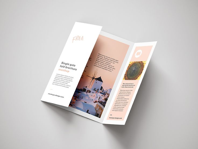
Here are some of the most common mistakes designers make
when designing leaflets:
Content-related:
- Too much information: Overcrowding your leaflet with text and images makes it overwhelming and difficult to read. Keep it concise and focus on the most important information.
- Unclear target audience: Who are you trying to reach with your leaflet? Design it with their needs and preferences in mind.
- Missing call to action: Tell your audience what you want them to do next, whether it's visiting your website, calling you, or attending an event.
Design-related:
- Poor quality images: Blurry, pixelated, or irrelevant images detract from the message and professionalism. Use high-quality, relevant images that complement your brand identity.
- Inconsistent branding: Your leaflet should be consistent with your overall brand look and feel, including colors, fonts, and logos.
- Unreadable fonts: Avoid using overly ornate or small fonts that are difficult to read, especially for older audiences.
- Poor color choices: Colors that clash or are difficult to read on the chosen paper can be counterproductive.
- Ignoring negative space: White space is important for balance and readability. Don't cram everything into one corner.
- Not considering accessibility: Ensure your leaflet is accessible to people with disabilities, such as by using high-contrast colors and alternative text for images.

Production-related:
- Using low-quality paper: Cheap paper can give a negative impression of your brand. Choose paper that is appropriate for your budget and audience.
- Not considering folding: If your leaflet will be folded, design it with the folds in mind so the message is still clear and visually appealing.
- Not getting feedback: Before finalizing your design, get feedback from colleagues, target audience members, or design professionals.
Additional tips:
- Start with a clear objective: What do you want your leaflet to achieve? Knowing this will guide your design and content decisions.
- Test different designs: Experiment with different layouts, colors, and fonts to see what works best.
- Less is more: Don't try to cram too much information or design elements onto your leaflet.
- Keep it professional: Your leaflet should reflect the professionalism of your brand and message.


